Woebot
Well-known member
<img alt="gage.jpg" src="http://www.woebot.com/images/dissensus/gage.jpg" width="500" height="500" border="0" />
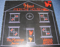
A while ago I posted some TERRIBLE LP covers at WOEBOT. I've subsequently found they're from an excellent book:
"The Worst Album Covers in the World... EVER"
The dude has a website too:
www.bizarrerecords.com
A while ago I posted some TERRIBLE LP covers at WOEBOT. I've subsequently found they're from an excellent book:
"The Worst Album Covers in the World... EVER"
The dude has a website too:
www.bizarrerecords.com