how to hide your face in the Wire

blissblogger

Well-known member
some clever sod has noticed and is documenting a Wire magazine stylistic trait which is for the artist's to conceal wholly or partly their face from the camera

https://twitter.com/WireFacesHidden

one of the examples is from my Rob Haigh piece from a few months ago where sure enough Mr Haigh used some kind of scarf to hide most of his face and or lurked partially hidden behind a bit of scaffolding

i suppose the idea is "we care not for mere frippery like image - the music's all that matters".

(Bit like when artists like Elvis Costello or Paddy McAloon - after they stopped having hits and getting on the teevee - grew enormous unruly thickets of beard to signify they were above such things as appearance)

I can imagine a younger Mark K-Punk celebrating this in terms of "defacialisation"

Although that stance (underground = unseen / "faceless techno bollocks" etc) was in rather flagrant contradiction to his glam celebrations

(or perhaps he would have said that the glam face was a stylized visage, a mask to hide behind)

This is one of the best images in this dude's selection
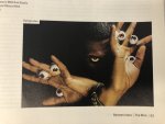
flyinglotus.jpg

probably accidental, but the profusion of eyeballs almost conceptually works with FlyLo's hiding from our eyes - sort of "here's looking back at you, reader, how you like that"
 

luka

Well-known member
the wire has always had the worst photography of any magazine on the shelves for some reason.
overall the magazine doesnt look too bad but the pictures have always been a disaster zone.

i suppose the idea is "we care not for mere frippery like image - the music's all that matters".

i would have thought it was more that they tend to look very very ordinary (not ordinary as a synonym for plain, ordinary as in normal, undistinguished) and that normal english middle class spam face demystifies and domesticates the music.
 

luka

Well-known member
although looking at the pictures on that twitter account is undermining my theory i have to say
 

Woebot

Well-known member
some clever sod has noticed and is documenting a Wire magazine stylistic trait which is for the artist's to conceal wholly or partly their face from the camera

the photography style they have chosen is EXACTLY in natural opposition to the drift of the magazine.

i have to be honest i think it's very delibidinzing and actually....... incredibly stupid.

those artists who disguise themselves have had the good sense to work around this massive error.

in fact imagery in the wire should be an amazing opportunity to go crazy with illustration and graphic design.

wot i fink.
 

luka

Well-known member
it's insane. there's clearly no one at the magazine with 'an eye' or if there is they've been locked in
a cupboard. it's been consistently terrible regardless of whos editing it as well. has been terrible and
in basically the same way for as long as ive been reading it which is now over 20 years.
 

blissblogger

Well-known member
the photography style they have chosen is EXACTLY in natural opposition to the drift of the magazine.

i have to be honest i think it's very delibidinzing and actually....... incredibly stupid.

those artists who disguise themselves have had the good sense to work around this massive error.
.

what you mean, that sort of portrait photography, either moody and shadowy, or with very sharp capturing of the grain of aged skin etc etc? further boosted by the glossy paper stock

yes if by delibidinizing you mean it's not sexy, i would agree with you there, although that's partly because elderly experimentalists and jazzers (or young geeky experimenters) don't tend to be easy on the eye.

perhaps it's a sort of extension of a certain kind of jazz photography, which itself is like author photography - how writers have tended to be photographed on the back of book jackets. iconographic, moody, unsmiling, dripping with I Am Serious Artist

i think Luka's right the games with self-concealment and masking is a ruse to get around how boring a lot of these musicians look
 

droid

Well-known member
The WIRE has always taken its design cues from the professional journal, graphic design, gallery catalogue school. Crisp lines, strict and clear grid structures. A serious, classical modernist style almost entirely devoid of frippery.
 

Corpsey

bandz ahoy
I'm definitely pro-WIRE and there's always interesting stuff in there, but for me... well, not so much that it's a shame that the Wire doesn't engage with popular music (cos that isn't its function) so much as that there isn't a WIRE-esque magazine that does.

Don't really care how it looks tbh
 

Woebot

Well-known member
what you mean, that sort of portrait photography

i think i really mean ANY portrait photography!! i mean, it's supposed to not be about "personalities" in that way surely? there's very few alternative musicians who have actively cultivated an image that seeks to be enshrined in that way.

a basic rule might be - do they have pictures of themselves on their record sleeves? if not - then don't represent them with a portrait.

it could be an amazing opportunity to do great visual work - even perhaps commissioning the band's designers/artists to work up artwork for the article? fr'instance imagine house doing the artwork for a piece on stereolab - rather than a useless photo.

i don't want this to appear hostile to the wire. it just seems like an obviously stupid thing to keep doing without questioning.

and more savage pencil artwork wouldn't go amiss for a start.

i think Luka's right the games with self-concealment and masking is a ruse to get around how boring a lot of these musicians look

i would imagine it's largely the artists saying "do i have to have a portrait, i look so ugly, how i look isn't what my music is about" - certainly that would be my reaction/suspicion.
 
Last edited by a moderator:

Woebot

Well-known member
The WIRE has always taken its design cues from the professional journal, graphic design, gallery catalogue school. Crisp lines, strict and clear grid structures. A serious, classical modernist style almost entirely devoid of frippery.

yes - but that doesn't need to always include portrait photography surely? or preclude more design and illustration.
 

droid

Well-known member
Well, as Im sure you know the philosophy behind that kind of design is to let the art do the work, big photos providing the colour with the minimalism doing the scaffolding. Certainly doesnt preclude illustration, but IIRC the only kind of experimentation Ive ever really seen in the WIRE has been some font manipulation.
 

luka

Well-known member
Well, as Im sure you know the philosophy behind that kind of design is to let the art do the work, big photos providing the colour with the minimalism doing the scaffolding. Certainly doesnt preclude illustration, but IIRC the only kind of experimentation Ive ever really seen in the WIRE has been some font manipulation.

eh?
 

Woebot

Well-known member

i think droid meant that the form of the presentation isn't meant to get in the way of the message. in the way that experimenting with fonts (the form) can do.

what was the name of that practically illegible music/culture zine of the nineties? not like that.

[and my point being that changing the style of the pictures shouldn't interfere with that]

#thread to Diggedy Derek right? Derek inherited this. He probably has very good reasons for keeping it as it is (Brand recognition - If it aint broke etc...) Also, gotta admit I haven't seen it often recently - not following music so closely.
 
Last edited by a moderator:

JWoulf

Well-known member
The wire aesthetic, purposely dry and dull in an attempt to reflect some intellectual or other value of the music. Which is daft. At times it extended to or was reflected in the music, Touch, As/OR, endless field recordings, snippets of mundane conversation, litterally dry reverbless crackles. Listening to Aube record drips of water in a basement. Which was amazing.

That said there are some pretty great images in that twitter account like what are you looking for some kind of vouge fabulousness?
 
Last edited:

Woebot

Well-known member
The wire aesthetic, purposely dry and dull in an attempt to reflect some intellectual or other value of the music. Which is daft. At times it extended to or was reflected in the music, Touch, As/OR, endless field recordings, snippets of mundane conversation, litterally dry reverbless crackles. Listening to Aube record drips of water in a basement. Which was amazing.

That said there are some pretty great images in that twitter account like what are you looking for some kind of vouge fabulousness?

i dunno. i'd hate for this degenerate into a thread slagging the wire off.

i mean, it's basically done for love. the journalism is thorough. they're determined to be at the cutting edge of what they do.

:love:
 

sufi

lala
i dunno. i'd hate for this degenerate into a thread slagging the wire off.

i mean, it's basically done for love. the journalism is thorough. they're determined to be at the cutting edge of what they do.

:love:
there's definitely a thing though where the exotic tune you've had on repeat gets a re-evaluation, quite undeliberately, because you've seen a picture of the artist and they just look humdrum like a bloke from your school or your neighbour - that's not a Wire-specific issue

or is that cos we were spoilt in the 80's when popstars looked outlandish up to our expectations (and so did i-D)?
 

Woebot

Well-known member
there's definitely a thing though where the exotic tune you've had on repeat gets a re-evaluation, quite undeliberately, because you've seen a picture of the artist and they just look humdrum like a bloke from your school or your neighbour - that's not a Wire-specific issue

ok this is similar to how i liked rita ora's "your song" imagined what a great trendy video it would have and then watched

THIS

(bunch of dudes and rita in 1980s business clothes - er no thanks)


(how wire-ish is that - not very)
 
Top