You are using an out of date browser. It may not display this or other websites correctly.
You should upgrade or use an alternative browser.
You should upgrade or use an alternative browser.
William Blake.
- Thread starter luka
- Start date
xenogoth
looking for an exit
this is coming up in ~2 weeks https://www.tate.org.uk/whats-on/ta...lake-artist/laura-grace-ford-on-william-blake
xenogoth
looking for an exit
yeah. that's laura. it is a heavyweight thing. par for the course when collecting however many zines went into it. bit like k-punk collection. weird to collect something like that together into when its contents were initially quite ephemeral.
she's great tho. really interested to see what she frames to the exhibition.
she's great tho. really interested to see what she frames to the exhibition.
Ok, the moment you've all been waiting for with baited breath. Last week I spoke with Mr K, a renowned local printer, on the newly built canalside in Salford, and asked him this very question (how come the lettering is so shit?).
His answers were as follows:
1. Blake was often doing the works he is now famous for in the evenings, after long days of commercial printing. So he was tired, and they could be a bit sloppy for that reason.
2. He was a well known engraver, and could have done the letters properly if he wanted, using letterpress (there's a rumour he did the letters, uncredited, for Hogarth) but his whole thing with these pieces is that he wanted them to be much more an integration of image and text, cos he was doing his version of illuminated manuscripts.
3. The actual method of how these are made is odd. They are relief prints (eg like lino or woodcut, where the impression is created because an area has been shaved away, but they are a bit more unusual, cos he left the raised bit as the image and text, whereas nowadays you would more likely cut away the image. Ive not explained this very well but basically he made it hard for himself.
4. He taught himself how to how to write backwards, rather than the normal method of writing it normally, then reversing it and copying the resultant pattern.
5. Few more prosaic issues: he was mixing his own colours and probably working with old or worn plates. And it's likely his plates would be damaged after just a few editions.
There, I hope that's cleared things up for people, I could feel the desperation to know the answers. You must all try hard not to read the plain text, instead look at the really unclear words on the plate itself and marvel at the integration with image, remember the limitations thus outlined.
Still not been to the exhibition.
Corpsey
bandz ahoy
Probably but very badly I'd imagine. Very very badly would be my guess. I doubt I'll even attempt to read the words. Luckily it's mostly pictures. About 200 pages long.
The arrogance :crylarf:
luka
Well-known member
The arrogance :crylarf:
You know what I mean though. It's possible to write well on art but things for major galleries are drastically dumbed down for the bovine herd
Corpsey
bandz ahoy
I'm as informed as you are as to what's written in there.
I would expect that they commissioned people who know a great deal about Blake and his art, though.
Fair point re: dumbing down. Although with art in particular I think dumbing down can be instructive. With Blake, I admit, there could be a problem, as it's all based on this complex mythology. Were these paintings supposed to be understood implicitly, or were you supposed to have a broken code in mind?
As I probably said earlier in this thread, seeing Blake's images plastered over tea towels and mugs in the Tate shop made me feel vaguely scandalised.
Corpsey
bandz ahoy
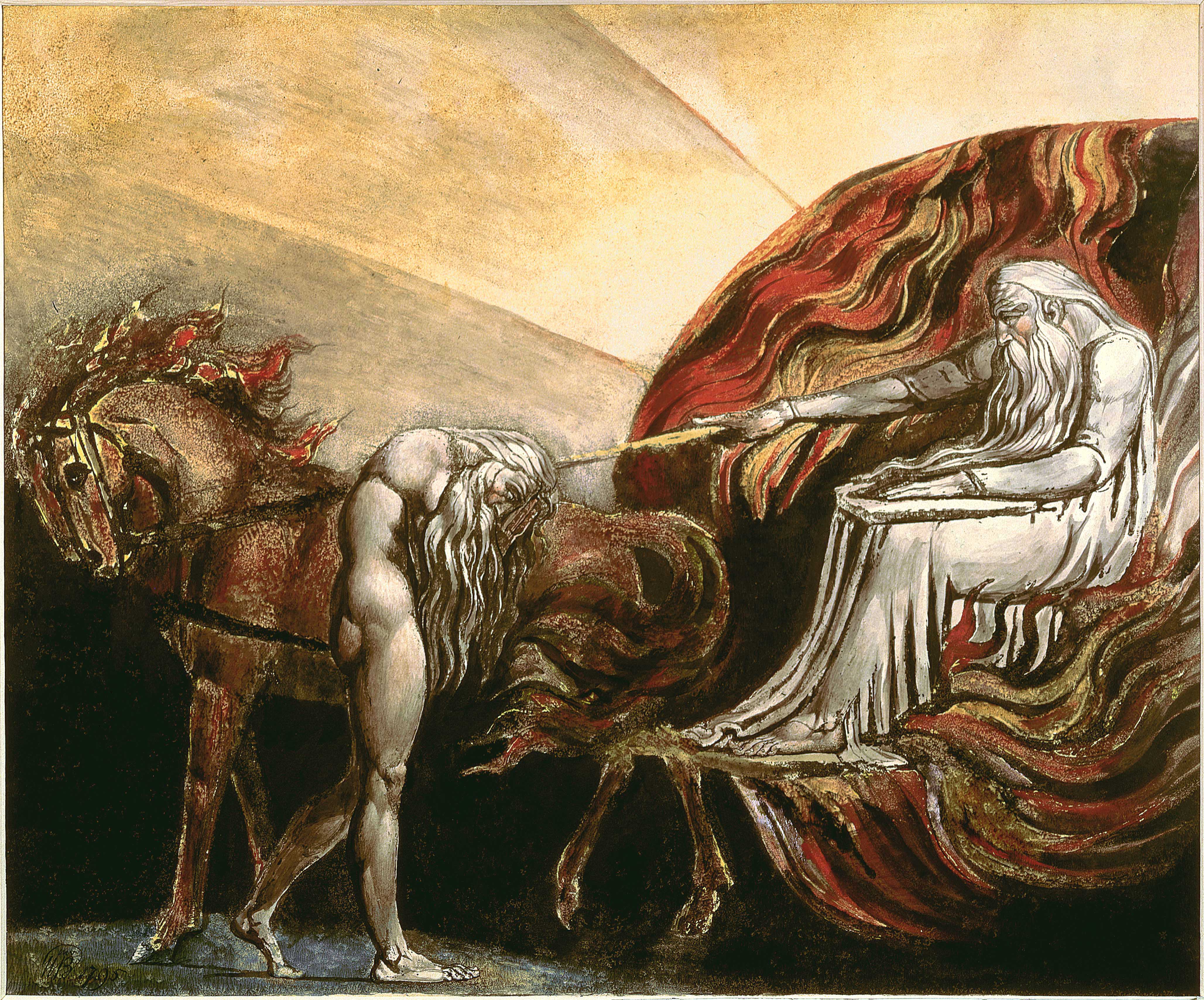
yeah if you go, please report back. this image also brilliant:
View attachment 1769
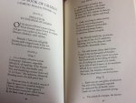
Although i would like someone to explain to me why the text is so unclear and hard to read. Surely something to do with the printing process?
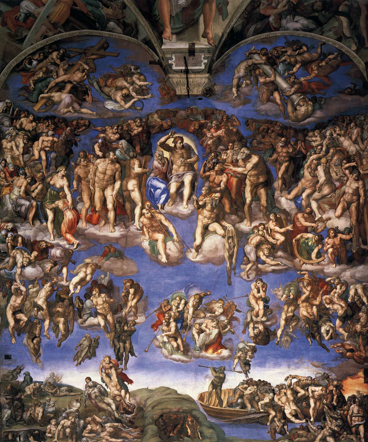
You can see here (as in a million other examples) how influential Michelangelo was on Blake

Still not been to this exhibition - has anyone else?
yeah i can see that - thanks for posting those images, never noticed the comparison. but then i don't really know any michelangelo apart from the odd statue.
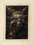
i guess whats interesting in terms of blake is how he's pushed the body. the way he renders the muscles and different body tones is crazy. so massively overboard. i don't know what he means by it - whether it's intentional or not.
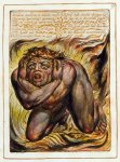
i was looking at another plate from Urizen today and he's got this figure surrounded by fire. it looks like he's defined the way the lines of the fire will flow, then used that for the body rhythms as well. maybe i'm wrong, maybe it's the other way around. but i sort of feel he's decided a lot of the backgrounds first, then used the same ideas for the bodies, which makes them pop even more, maybe.
looking forward to the exhibition - still not read any of the poetry tho. i just like the pictures.
I went yesterday and enjoyed it. The pictures of children are good because he makes them look like vaudeville strongmen only half a foot tall and with faces that closely resemble his own aged 53.
I had a while to wait there before going to work so I got a bit of time to read. One thing was that, on a basic level, the recurring mythic poles of orc and urizen impress themselves and map on to the experience of reading the poems. A lot of time while trying to read I would glaze over, eavesdrop, wander off, think about dinner, be distracted by back pain, unable to make out words, overly aware of the absurder aspects of Big Shows and the stultifying effects of curatorial practice under Urizen. Then there would be a few moments where you tune in and get carried away with a passage, feel charged up, focus intently, sweat profusely (maybe due to back pain, gallery lights, lots of people but still...)
Normally there is something at least a bit disappointing about retrospective blockbuster shows, like they are at best going to be good in spite of the awkward and malicious conventions of the museum and the uncomfortable effect on your back, but with this one those conditions seemed to be acknowledged and dealt with as expanded parts of the show, which also work as visceral access points for different themes of the books.

